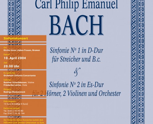
Corporate design for the orchestra Sinfonia Concertante.
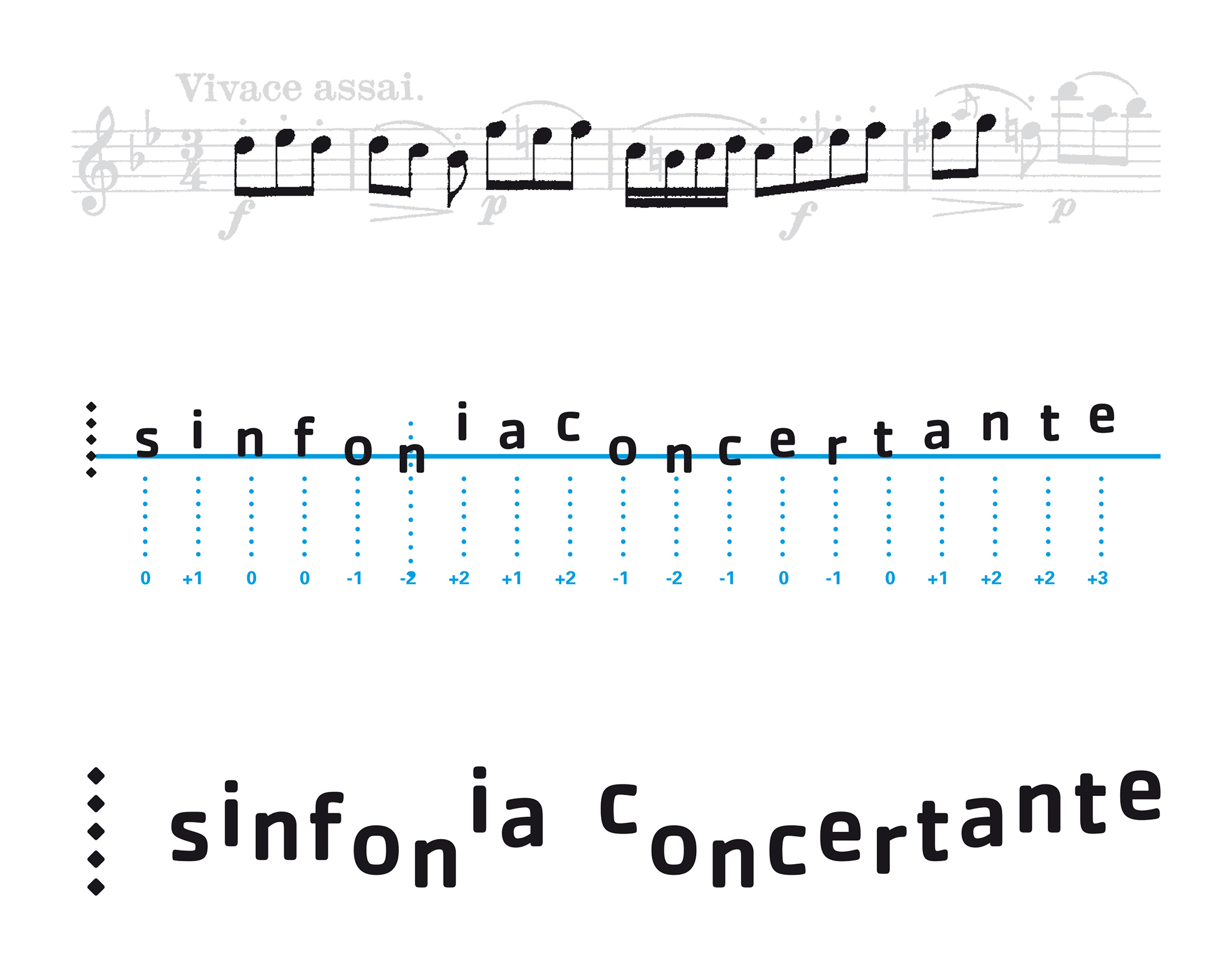
The orchestra’s logotype is not static but changes with every new concert —like the music and the artists involved. Therefor, the name “sinfonia concertante” is modified in such way that the letters offset in relation to the baseline of the initial “s” correlate with the pitches of the first notes of the music played.
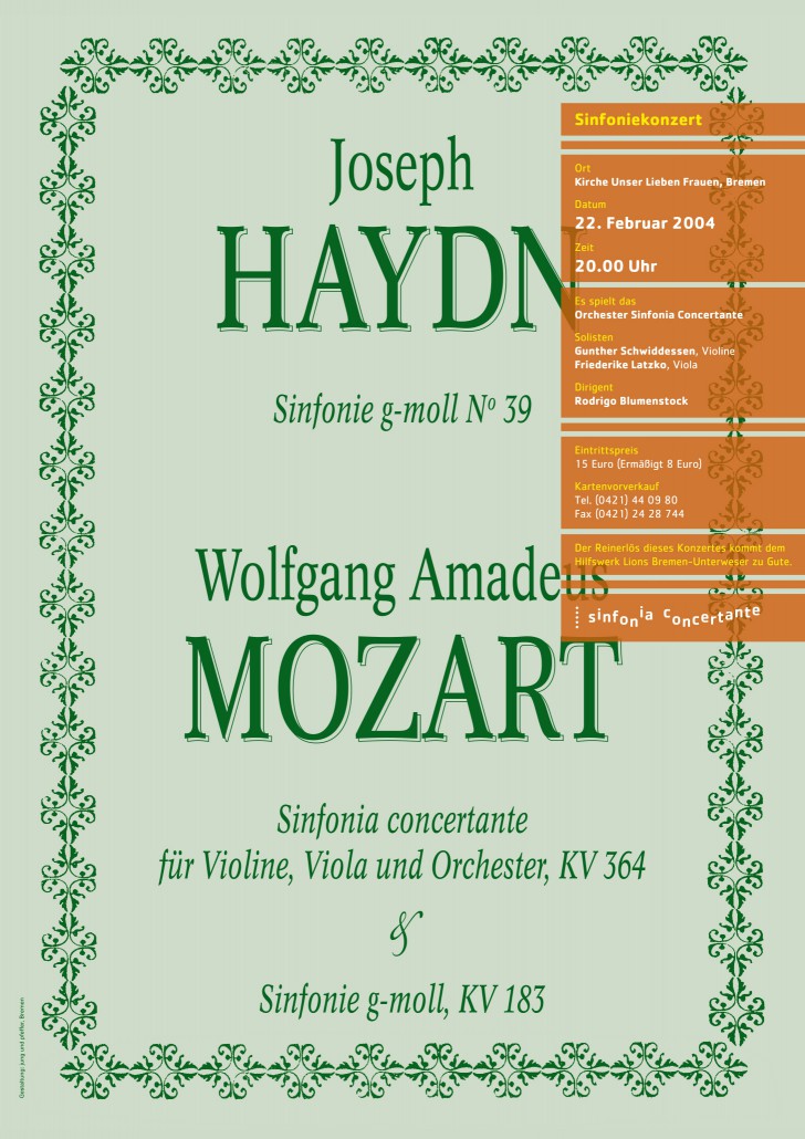
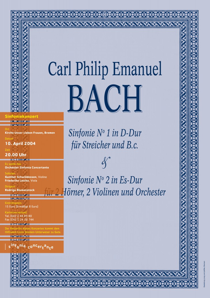
The posters for the concerts resemble classical scores. The actual detail information for the events is printed on top using a copper spot color.

